

Frustrated that your site doesn’t rank high enough on Google? Do people visit your website but leave without giving you a lead?
If so, it could be that your site just simply isn’t usable on mobile. Mobile traffic isn’t an issue dealerships (of any size) can afford to ignore anymore. Nearly 50% of web traffic is generated from mobile devices.
This means your website needs to look good on tablets and phones. If not, you could be alienating up to half of your dealership’s digital shoppers.
Why Optimize Your Site for Mobile?
There are two big reasons why you need to optimize your website:
- User experience – It’s annoying to view a webpage on your mobile device that hasn’t been optimized. One must scroll back and forth to read all the copy, and that is a fast way to get people to leave.
- Search rankings – Google gives preference to mobile-optimized sites in mobile search results. If your site and its pages are optimized, you stand a better chance of ranking higher on Google’s search results.
Three Ways to Check Your Site’s Mobile Friendliness
Checking to see if your webpage is mobile analyzed is easy. Here are a few ways to do it:
Google Mobile Tool
Grab your web page URL and plug it into Google’s mobile-friendly tool here.
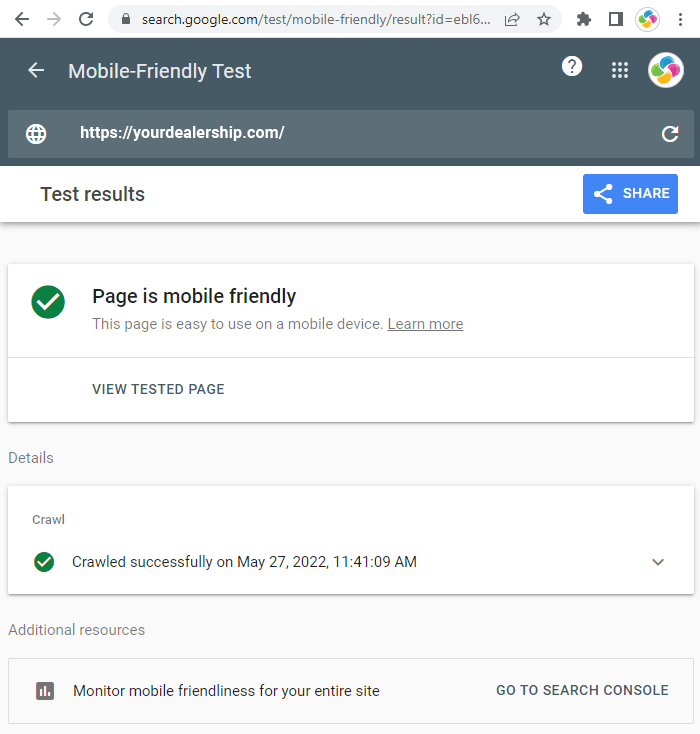
In seconds, Google will tell you whether or not your page or site is optimized for mobile. If there are problems, you’ll get some details on the probable issues, such as:
- Content is wider than the screen
- Text is too small to read
- Links are too close together
- Mobile viewport isn’t set (this keeps users from having to scroll horizontally to see the whole screen)
Google Search Console Monitoring
Google’s Search Console lets you monitor your website metrics and offers a host of other benefits, but you can also use it to check your mobile friendliness.
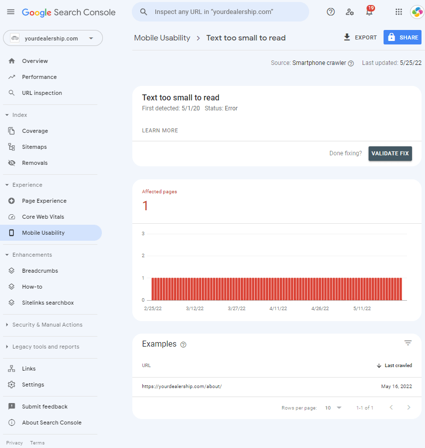
Check the tool’s Mobile Usability report. This shows which pages on your website have usability problems on mobile devices. Click here to open the mobile usability report. You can click through for issue details and recommended solutions for each problem.
Google Chrome’s Device Mode
This Google tool, part of Chrome’s Developer Toolkit, simulates different devices to get a picture of how your webpage looks on them. Want to see how your page looks on an iPhone, a Samsung, or a Pixel phone? Here’s how:
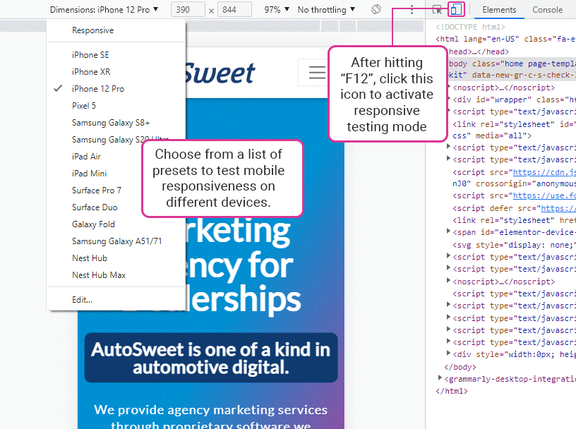
- Type F12 (click Function + F12) on a laptop or desktop keyboard to open Google’s web developer tools.
- A window with the page’s code opens on the right side of the page. At the very top of that window, you’ll see an icon that looks like a mobile phone and tablet (such as an iPhone and iPad).
Click that icon. - A simulation of your webpage opens at left, showing how it looks on various mobile devices. On the left window at top, you’ll see a drop-down list labeled “Dimensions: Responsive.”
You can click that drop-down list and choose any number of mobile devices to see how the page looks on them.
How to Optimize Your Site for Mobile
Now that you know how to check your pages’ mobile responsiveness, you may find some pages aren’t optimized. What should you do?
Unfortunately, there’s no simple switch to flip to optimize your site for mobile devices – some web development is needed. The good news is that AutoSweet can help!
Our fully responsive dealership websites are beautifully designed around Google’s Mobile-First Index. We design strong, well-converting websites, no matter what type of device your customers are using.
Ready to see how AutoSweet can help get more traffic to your website and generate more leads that result in sales? Reach out to us today to schedule a 5-minute strategy session!


