
Do you look at your dealership website and wonder if it could look better? Does it seem cluttered, overwhelming, or just “off” somehow? If you feel that way, your customers probably do, too. A website needs to be easy and pleasant to use, offering the user value.
It’s well-documented that companies with good user experience on their websites have higher sales. That’s because customers are happy to use their sites and don’t angrily shut their laptops in a fit of frustration because a website was hard to navigate (we’ve all been there.)
There are also proven design tactics savvy dealers can implement that will help encourage shoppers to buy and/or fill out a form for more information about your vehicles…
#1: Display Your Dealership’s Positive Reviews Next to Lead Forms
If you’re not displaying happy customer reviews next on your VDPs next to your lead forms, you’re missing out big time!
Research from Northwestern University’s Spiegel Research Center determined that conversions increased by a whopping 380% when positive real reviews were displayed for high-priced products!
That means if you are getting 10 leads a month currently from your VDPs, displaying positive reviews next to your forms on these pages could lead to as many as 38 MORE people a month filling out a lead form.
Helpful Hint: If you’re an AutoSweet Reputation Management client, reach out to your digital marketing consultant for help getting a widget added to your site that will automatically display positive reviews for you!

#2: Improve Your Page Speed & Improve Your Conversion Rate
One of the most overlooked aspects of website design is one that can have the biggest impact on your bottom line: page speed. A web company that works with brands like Adidas, Portent, did an extensive study to determine how goal conversion rates compare based on page load speed.
For a simple example, let’s assume 2,000 people visit your website every month and the main goal of your website is for people to fill out forms on VDP pages:
- 1-Second Load Time: 39% Conversion Rate780 VDP form fills a month
- 2-Second Load Time: 34% Conversion Rate, 680 VDP form fills a month
- 3-Second Load Time: 29% Conversion Rate, 580 VDP form fills a month
- 4-Second Load Time: 24% Conversion Rate, 480 VDP form fills a month
- 5-Second Load Time: 22% Conversion Rate, 440 VDP form fills a month
According to the goal conversion rates Portent found, hypothetically a dealer could end up with more than 200 additional form fills a month by reducing page speed load time from 4-seconds to 2-seconds.
Note: A lot goes into conversion rates on a webpage. You may not see these exact numbers, but based on the Portent study, you can definitely expect to get more form fills by simply speeding up a slow website.
So, how you can improve page speed with easy design changes?
Speed is driven by more than just your internet service provider or computer. What’s on the page matters too, from images to videos.
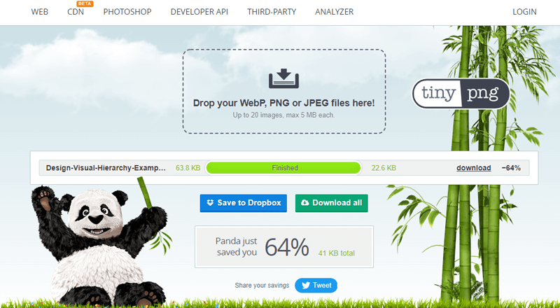
One of the biggest mistakes you can make on your page is not compressing your images for the web. Free and easy web tools like tinypng.com quickly compress images, making them load faster without loss of image quality.
Google also has a great page speed tool. Enter your URL and see how long your page takes to load. Remember, your goal is less than 5 seconds!
#3: Use Basic Design Rules to Help Guide Users Towards Conversion Goals
No one expects auto dealers to be web designer pros, but you should look at your site with fresh eyes occasionally. Specifically, you want to ensure that it’s as easy as possible for shoppers to find information about the vehicles you have in stock.
And, on specific VDP pages, you want to make sure any forms and phone numbers on the page are as easy as possible to find.
How can you use design to do this? Essentially you can highlight which parts of your website are most important by using color and contrast, scale, and grouping.
In other words, make your most important elements larger than others, use brighter or higher contrast colors, and/or group important elements together to draw attention to them.
See the image below of a sample VDP page. Notice how the form on the left stands out so much more?
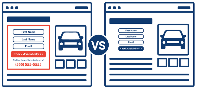
- We’ve used grouping to create a border that separates the form from the rest of the page
- The text on the button is larger than the standard body copy
- The button color is red while the rest of the colors on the page are blue. Blue is on the opposite side of the color wheel as blue, so it easily stands out on the page.
- We’ve also included a phone number in large bright colors on the form for shoppers to more easily find
These simple design techniques help shoppers visually understand the next actions they need to take to learn more about a vehicle on your website.
It’s important to remember though to use these techniques sparingly. If everything on your website is important, then nothing is. You need to highlight the things you want shoppers to take action on first.
Final Dealer Website Design Advice? Keep it Simple
On the web, as in any communication, you should keep it simple. You’ve got a lot to share with your customers but they can only handle a small amount of information at a time. Use this list to simplify your user experience and make your website usable and accessible while showcasing your brand and inventory.
Would you rather be on the phone or the floor instead of working on your website? Let us help! Call AutoSweet for a free website review today and we’ll give you a free consultation.